Friends of the Ruin
2020Award
Red dot: Brands & Communication Design
Graphis
Website
https://www.theruin.org/
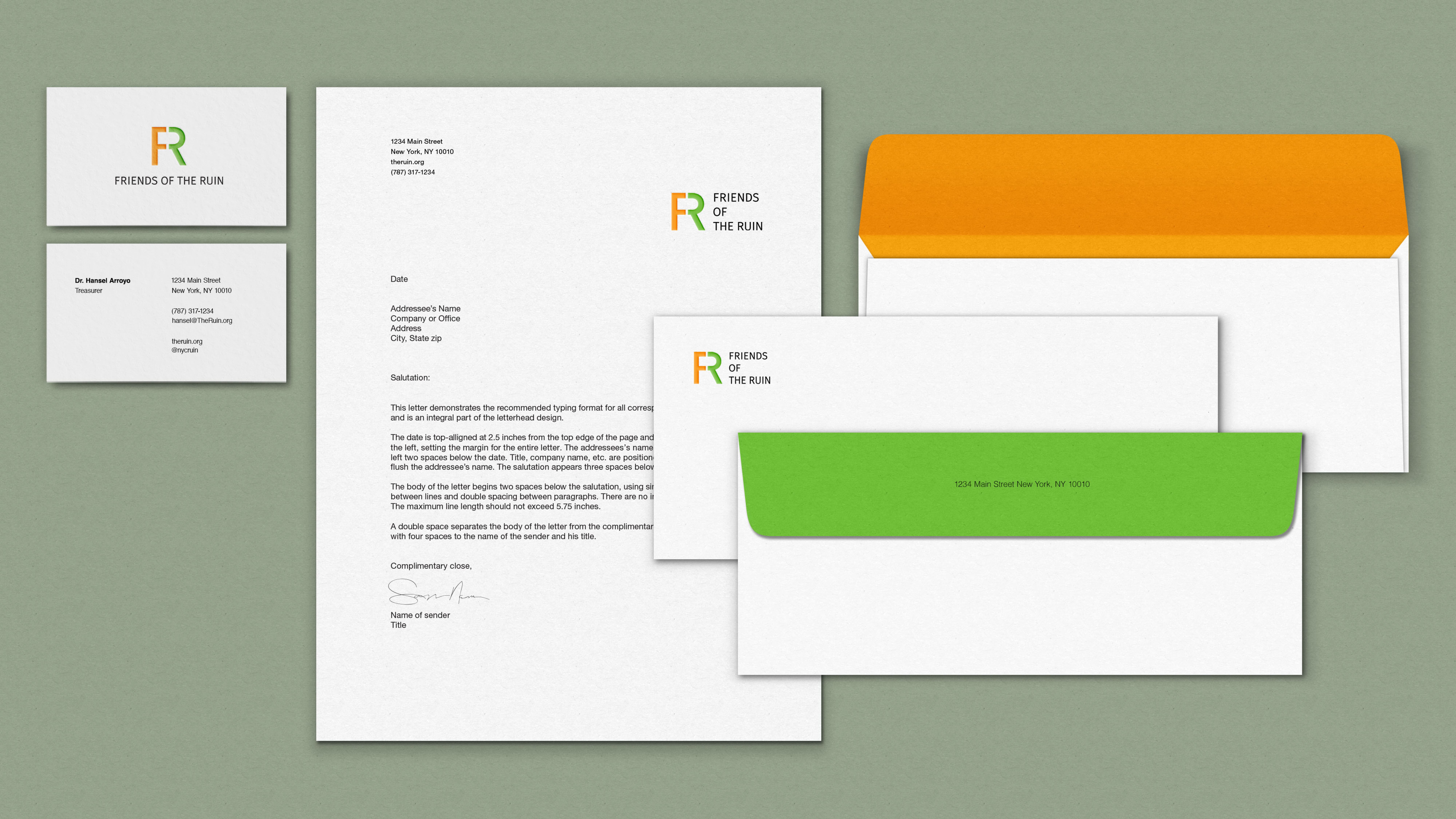
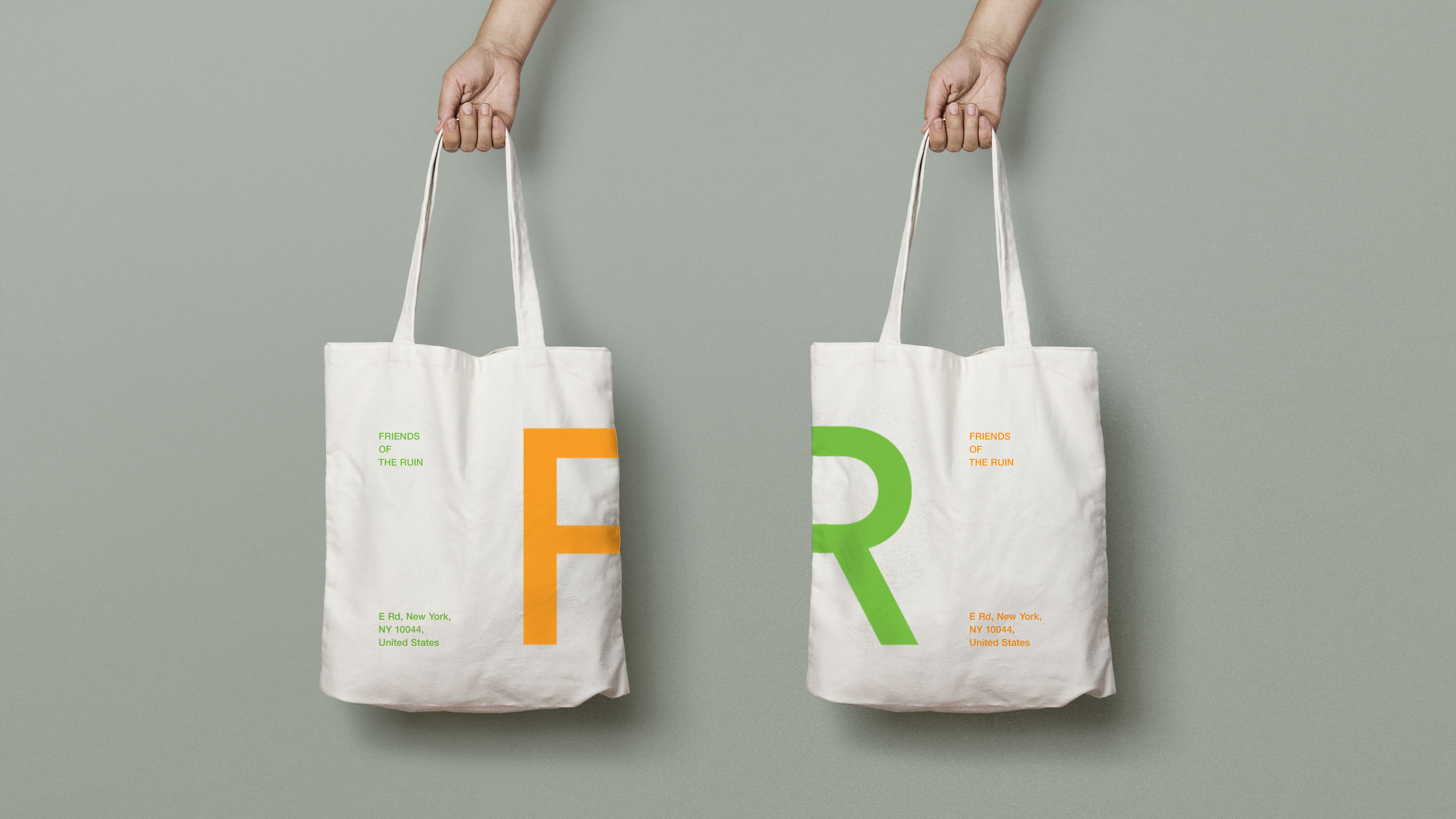
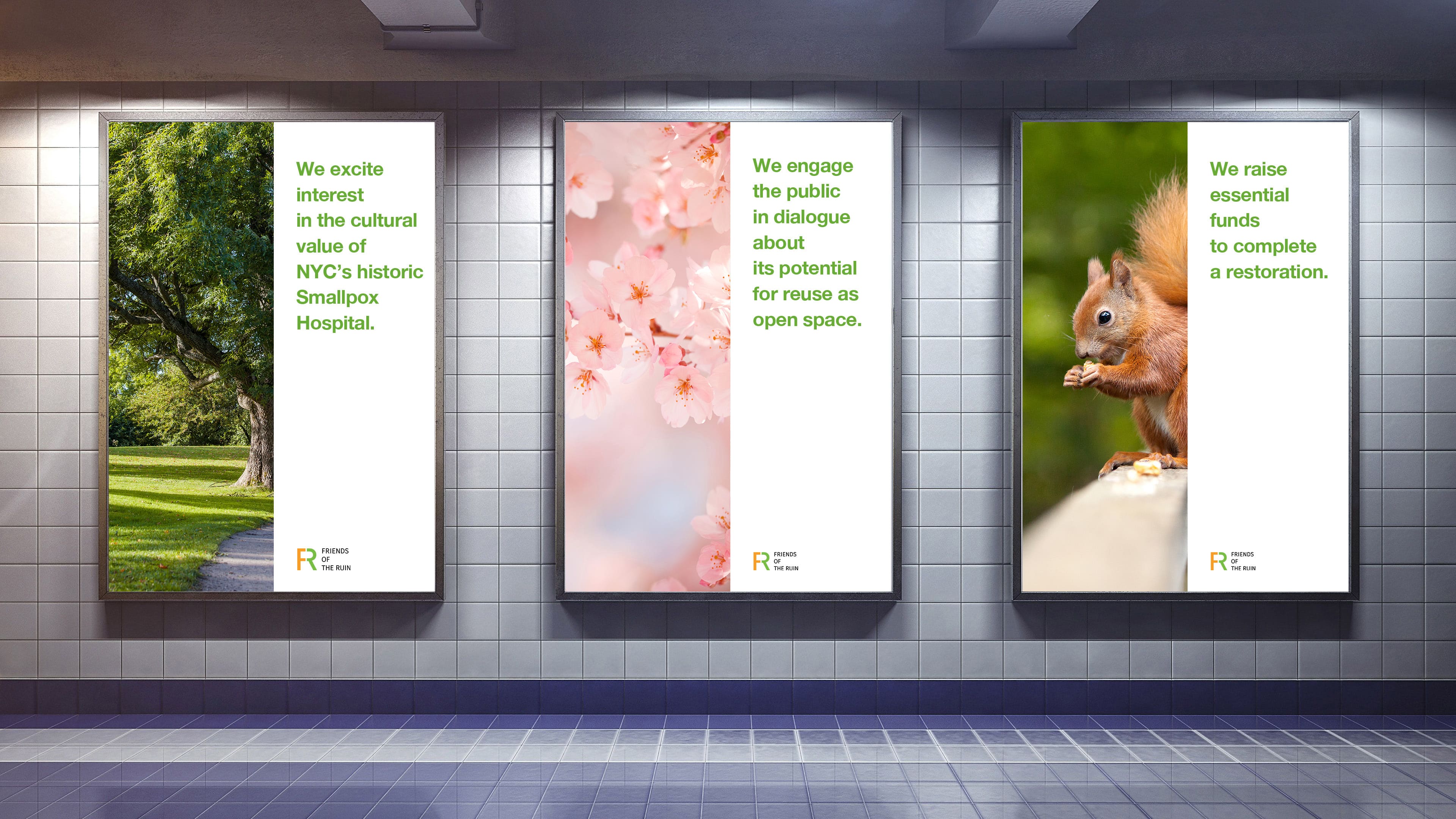
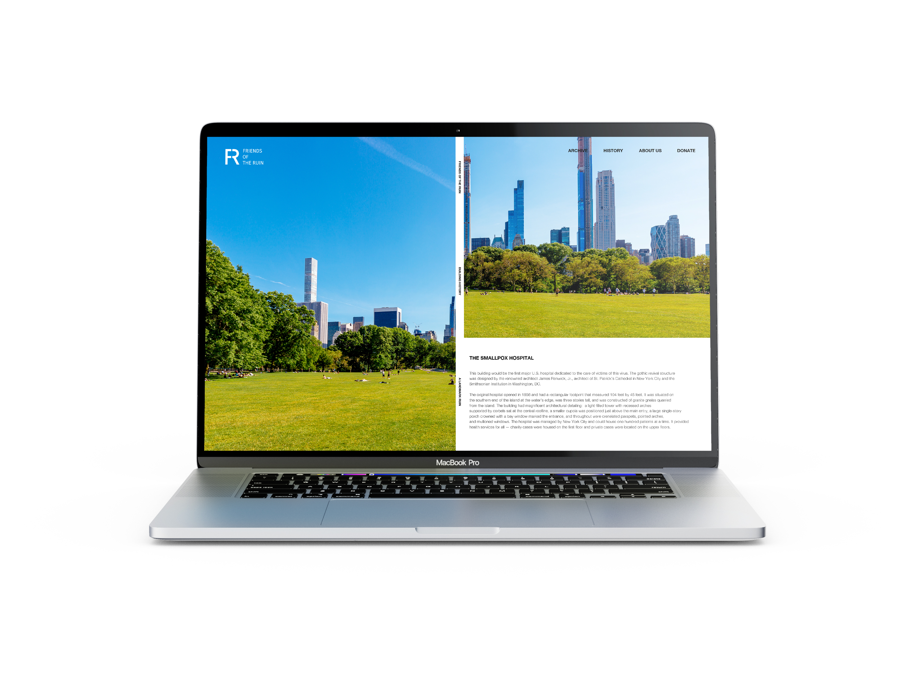
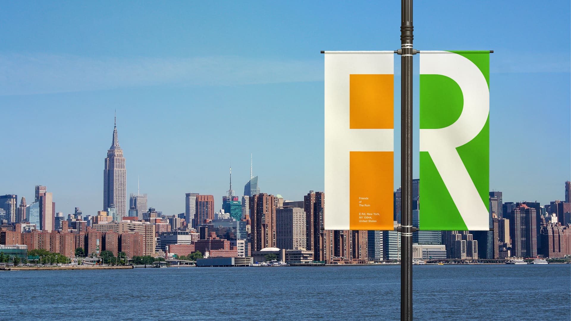
On Roosevelt Island of New York, the historical Smallpox Hospital stood since 1856. However, after the pandemic and destruction due to fire, the site has been neglected by the public for decades. To revive this historical site, Friends of the Ruin (non-profit organization) has set a mission to regain the public's interest in this site and complete adaptive reuse of the building as open public space. In order to achieve this goal, rebranding Friends of the Ruin was crucial to portray the intention and vibe of the organization. The logo is a combination of the letter F and R to form the letter R as a whole. The intention was to portray how Friends of Ruins adapt the remains of the historical site into one new harmonious public space. Just like the ruin, each letter is incomplete and unstable. Yet, they support each other to create a harmonious one solid form.
Inspiration
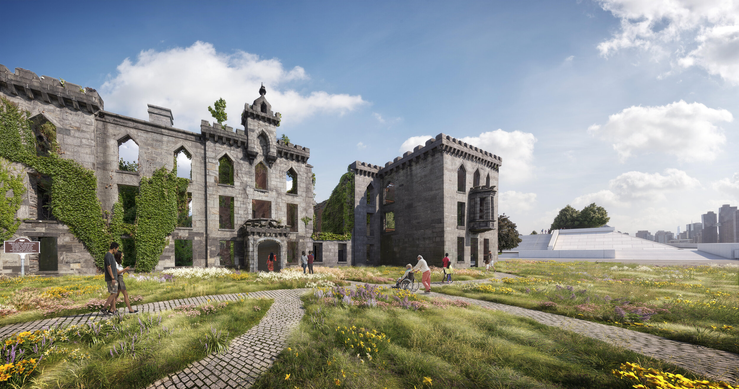
How Friends of the Ruin adapt the remains of the historical site into one new harmonious public space